I want to start by saying that this game is super fun and I'm having a blast playing it. The devs are doing a great job improving it steadily and are listening to their player base which is great. Now that there are steam players on and you can find games quickly it's even better than before! Bravo devs!
But, I'm a nitpicky fellow, so I'm going to dump all my suggestions in this thread. Some things are important, most are annoyance fixers that may or not already be on the dev's radar.
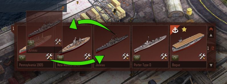
DRAG AND DROP SHIPS - You should be able to drop your ships into whatever order you want. Grab a ship, drag it onto another and they'll switch positions. Either that or allow ships to be placed in between two others.
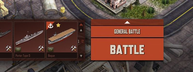
BIGGER BATTLE BUTTON - The arrow for choosing battle types feels annoyingly small. Beefing it up would be easy and solve that issue.
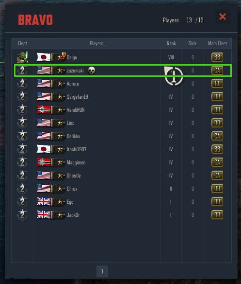
IN-GAME BOUNTIES - Have each player on a team matched with an enemy, who is their target (marked with a skull). If they kill that enemy they will double their XP and Credit haul from the battle. If that person kills them, they will have their XP/credits halved. This would give an extra kick of excitement to each match.
RESULT SCREEN STREAMLINING - the current result screen is cluttered and messy. You need to click to view the ranks, and really it could do a lot more with the given space. The top bar gives the win/loss and xp/creds, and has the option to immediately get back into the battle queue (REALLY WOULD BE APPRECIATED). The captain and ship info is compressed to save on space, and the now free space underneath is filled with the ship ranks for the match. This subsequently eliminates one of the side tabs. The ship ranks themselves are just labelled, and a "sink" column is added so you can see who was awesome and who sucked.
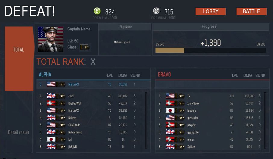
EDIT: 03.10.15
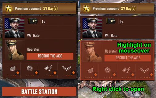
CAPTAIN AND BATTLE STATION STREAMLINING - The way the captain and battle station menus work now is unintuitive. You can right click to open captain, but not aide or officer? And what does battle station mean? So: Remove the battle station button, split the box into two separate ones with mouseover highlight, and have them open when you right click. This will be consistent with the way you open your ships menu and it will be fast and clean. Alternately, it could be opened by left click too.
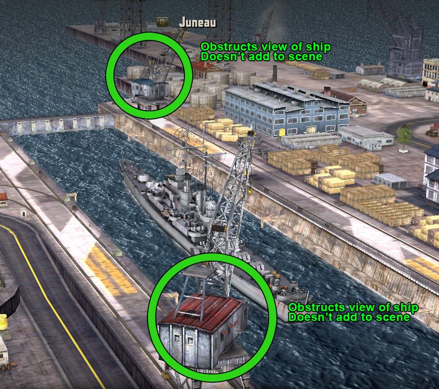
REMOVE THESE TWO CRANES FROM SHIP SCREEN - They obstruct your view of the ship when you want to get a nice 3/4 view and add nothing to the scene. They can be removed for better visibility.
